Tech Summit is an internal event for Adobe’s engineering community. It brings together engineers from across the company and regions to present and discuss the company’s technology vision, advancements in software, engineering, AI/ML, etc.
Client: 
Tech Summit ‘Chairs’ and the Keynote Producer
My Role:
Primary designer
Focus areas:
–  Brand/Event Identity
–  Event Keynote Design + Animation
–  Stakeholder Communications
End User:
Attendees (mostly engineers) of Tech Summit
Collaborators:
–  Creative Director
–  Teammates (Graphic Designers and Animators)
–  Keynote Producer
–  Video Editor
Timeline:
~10 weeks total
Deliverables I created:
My Process (an overview):
–  Received the brief
–  Designed a collection of event lockups
–  Explored creative concepts to represent the theme: ‘Inventing Beyond Barriers’
–  Feedback and design revisions
–  Client selects my design concept
–  Refine the look and continuing designing supportive elements
–  Produce the style guide and powerpoint template
–  Event gets cancelled in 2021
–  New date set for 2022
–  Connect with the Keynote Producer to understand support needed
–  Produce sets of presentations & executive keynotes with my team
–  Share animated media with the video editor
–  Feedback loop with content and video + animation edits
–  Approved deliverables handed off to production
I Learned:
Working on the animations, work smarter, not harder. Choosing to create them in Keynote with the presets was a huge time-saver, while still reaching almost identical results with the animation. Using After Effects would have added hours of work with ideation and making frequent edits from the speakers.
Pitching my concepts, I learned to have conviction in your ideas and not to overly compare one’s work with others. I focused on mine and kept iterating to make it the best it could be for the client.
The results:
A visually cohesive internal event, that my team and I produced to live up to the standards of external events. The event hasn’t gone ‘live’ yet, so still waiting on feedback from the audience, but our stakeholders are very happy with how it turned out.
What would I do differently:
I like to truly own my projects and know everything I can to prepare and produce the best work. I’d ask to be more involved in the Production calls, to meet with the editor and producers all at the same time to discuss timelines and processes, and to be a fly-on-the-wall to learn more about what others are doing. My Creative Director took those meetings and relayed the relevant information to me.
Event Lockup
The first step to an event is determining the theme. Once the event coordinators and chairs decided on ‘Technology For All’ (which *spoiler, they ended up changing it), they needed a lockup to represent the event across materials. A handful of designers on my team worked on lockup designs to pitch to the client.
Requirements:
–  Include the Theme
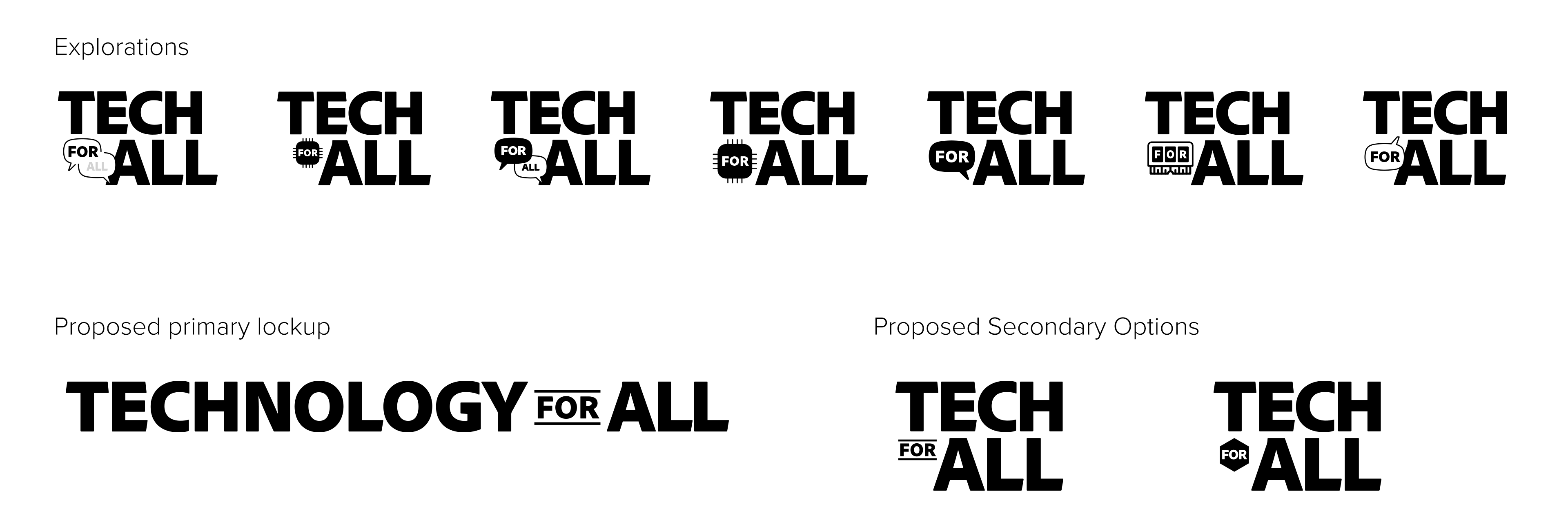
–  Experiment with text and shapes
–  Be creative with it

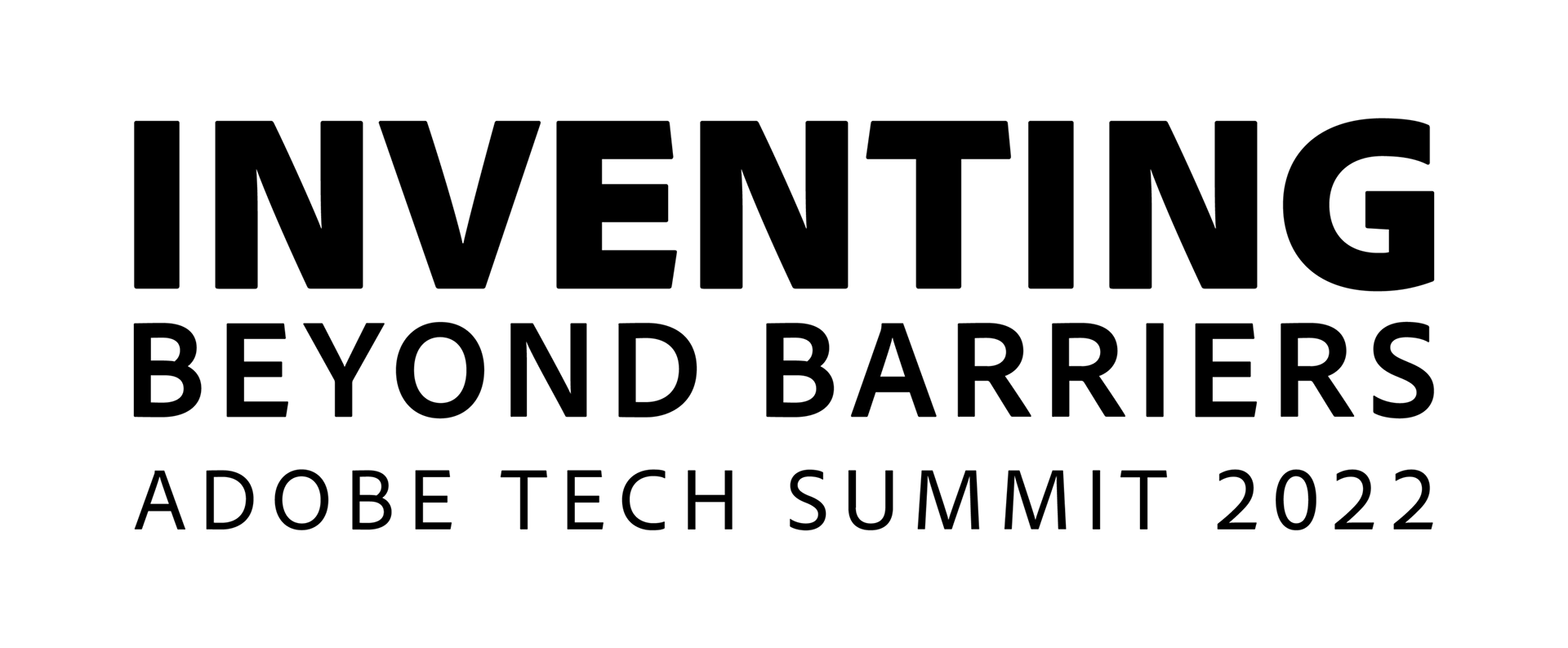
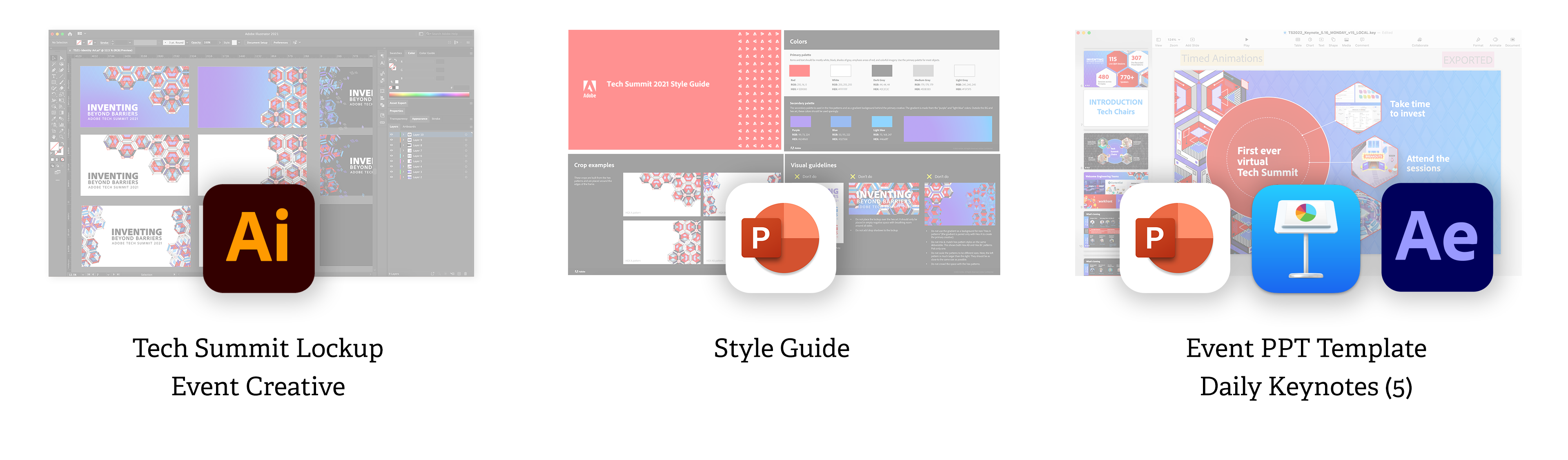
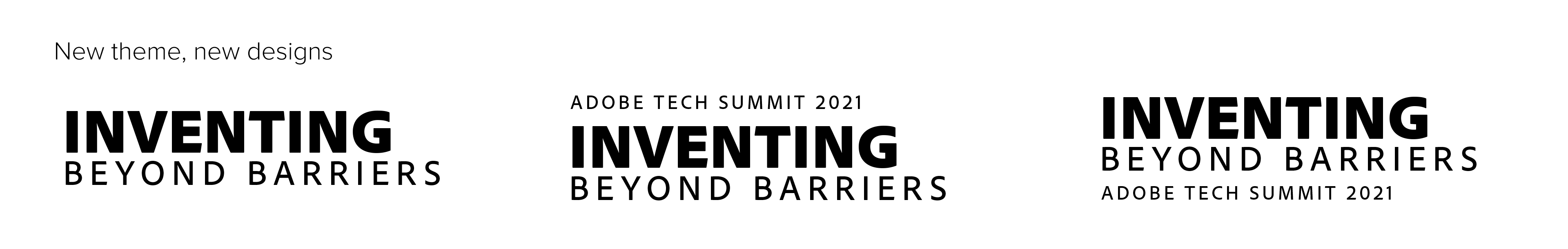
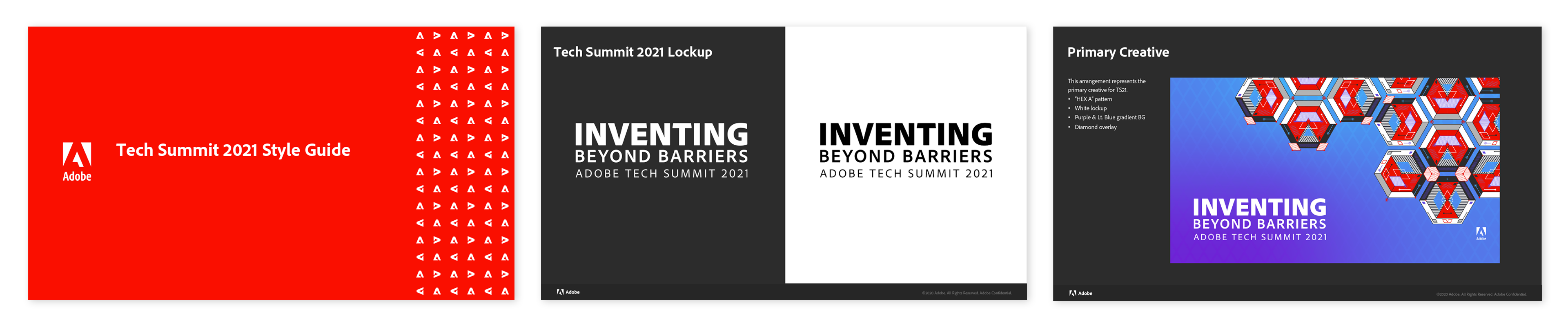
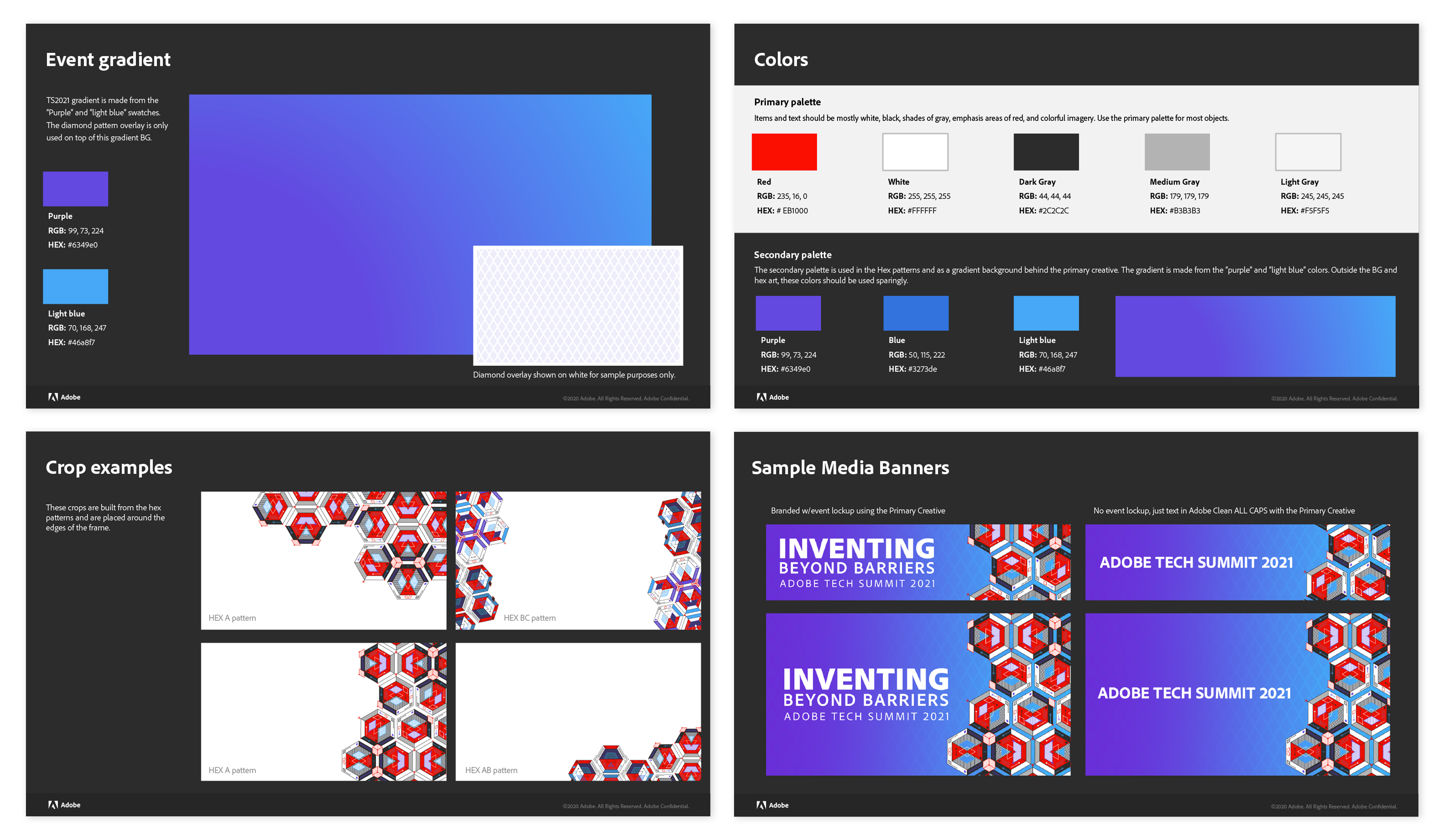
The final lockup for Tech Summit

Process
–  Looked at past Tech Summit lockups and other Adobe materials to refresh my memory, give inspiration, and see what structure of a lockup would most likely get approved (rather than just being creative and bouncing off the wall with ideas that I knew had no chance at survival)
–  Reused a common Adobe ‘for all’ element among my design explorations
–  Found that spelling out ‘Technology For All’ in combination with the preferred Adobe stylings was limiting me to a horizontal style, so I shortened it to ‘Tech For All’ and had more success with design explorations
–  Used shapes (hexagon, speech bubble, computer chip) in some to give illustration to the theme, rather than just text
–  Shared the lockup designs with my team for feedback, prior to my Creative Director sending a selection to the client
–  *SWITCH UP* The Tech Summit event coordinators and chairs decided to change the theme to ‘Inventing Beyond Barriers’, so back to the drawing board for a new lockup
–  My Creative Director decided that a simpler lockup would work best in the end. I created the final stacked design using a structure and font weights that our brand team would have no trouble approving
Event Creative Identity
Now that the event theme was decided on and there was a lockup, we needed visuals to support it. The visuals that the client selects, go on to represent the event across every interaction. Several designers, including myself, put together creative concepts and pitched our ideas for a chance to ‘win’ the creative. *Spoiler, mine won.
Requirements:
–  Consider how to visually represent ‘Inventing Beyond Barriers’
–  Use Adobe brand colors
–  Present your ideas for a chance to be selected
Process:
–  Started by looking for inspiration on Adobe Stock for art that could represent things like inventing, thinking outside the box, and engineering
–  Found a collection of cubes on Stock that I used as a starting point for my concept; changed some layers, updated the colors, and played around with layouts for how they could live together
–  Prepared a handful of mockups to share with my fellow designers and get their feedback (which was positive) and they encouraged me to explore treating the cubes as ‘rooms’, and to create a pattern to supplement the cube art
–  Explored the cube as a room idea and added in characters, making sure they were isometric in nature to fit the perspective the cubes were using, and made it look like they were interacting with ‘screens’ in the room
–  Used ‘repeat grid’ in Illustrator to generate a variety of patterns from the cubes and their elements. I quickly gravitated towards the simpler patterns and their viability in combination with the cube(s).
–  Continued iterating and sharing with my team, which led me to ultimately create the ‘hexes’ that would become the focal point of my concept
–  Shared another round of mockups with my team, and eventually the client, where they identified mine was their favorite and they wanted to continue refining it
–  Refined my concepts, weeded out the unnecessary extra options to develop the hero art that included the hexagons, a subtle diamond pattern, a blue-purple gradient, and high-contrast colors

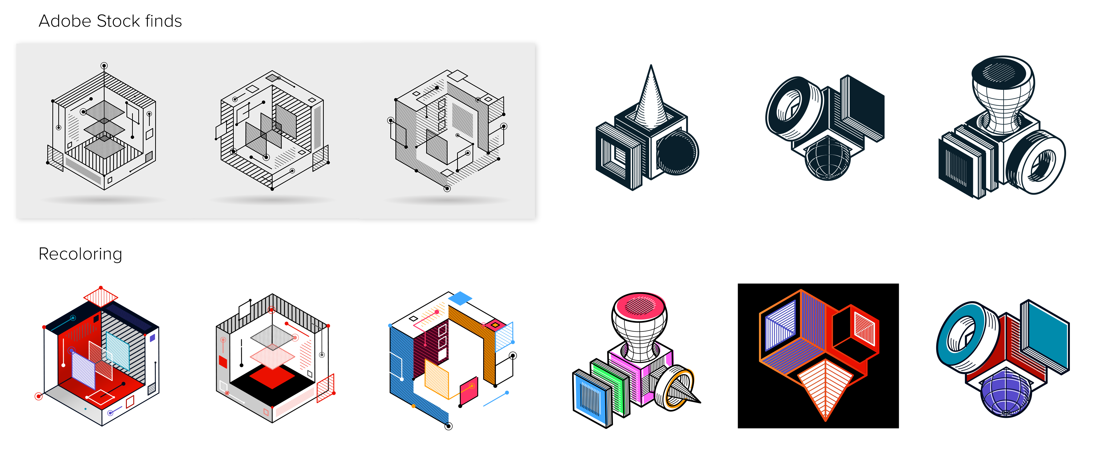
Early stages of ideation building from Adobe Stock finds

Explorations of cube arrangements, kaleidoscope effects, different background colors and gradients, and early mockups.

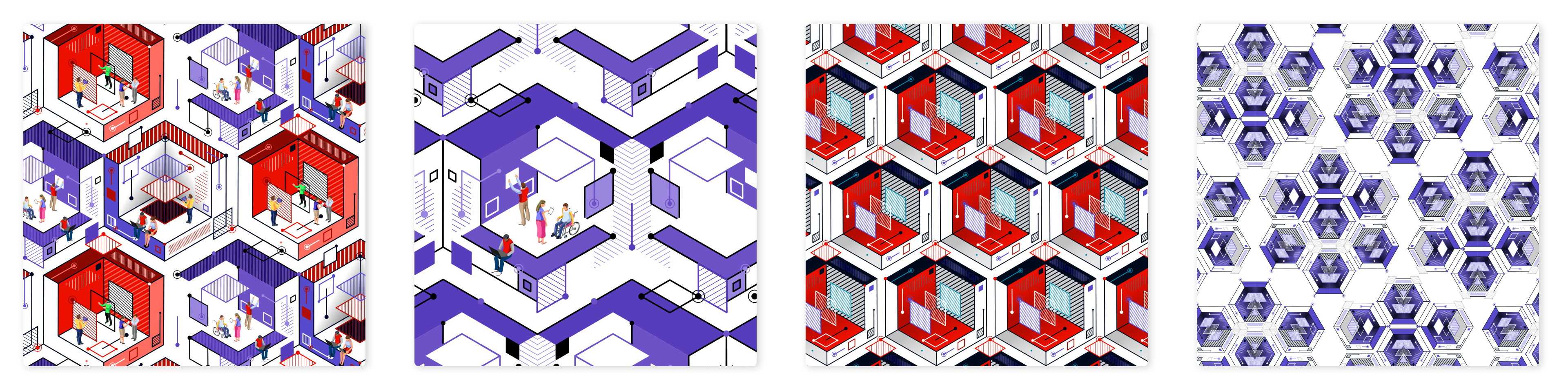
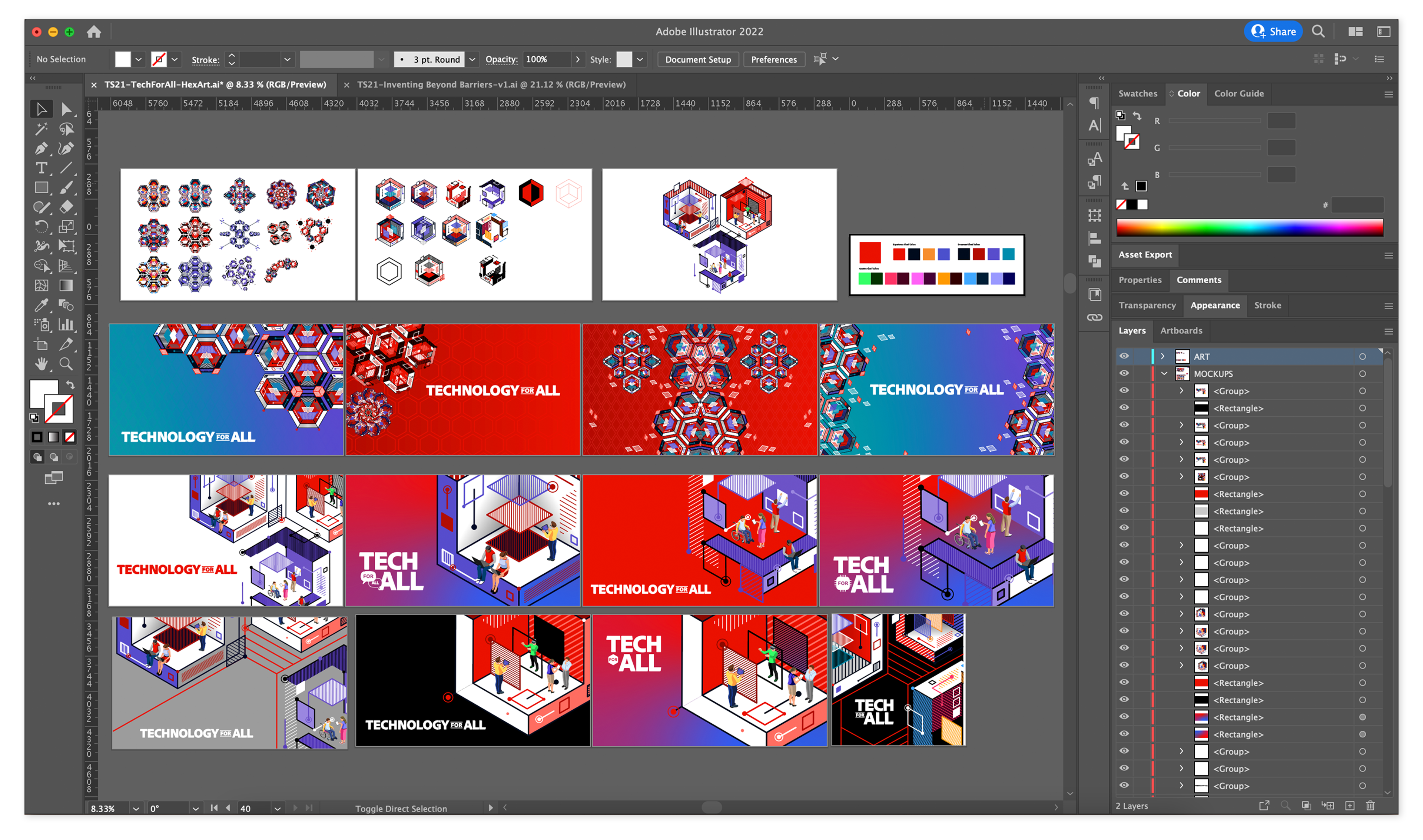
Complex patterns using Repeat Grid in Illustrator. You can see the people in the first two to illustrate the 'room' effect. All of these were ultimately too busy.

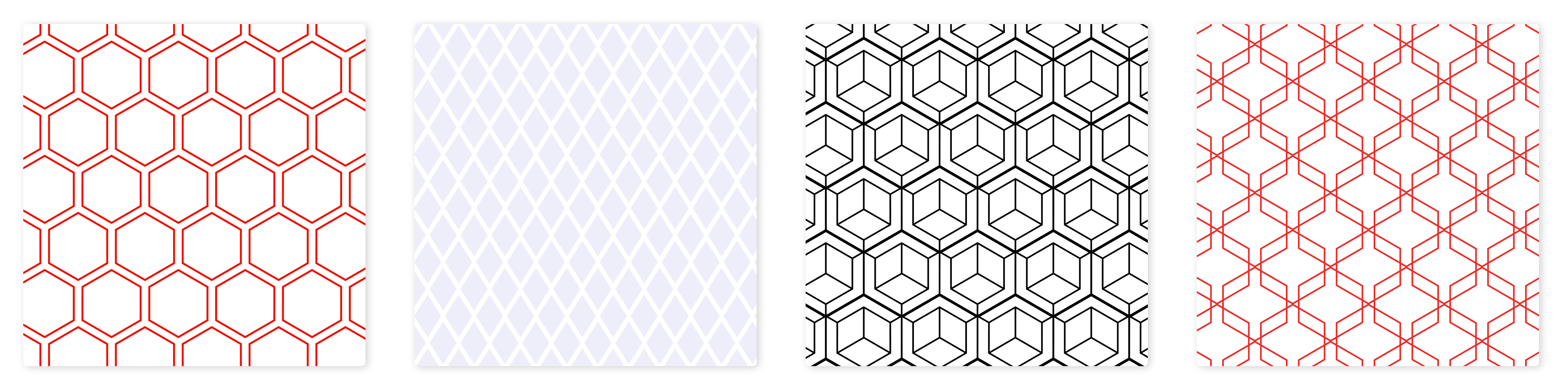
Simple patterns that I was testing as a supplemental design element to add more depth to my mockups. The diamond pattern was used in the final approved concept.

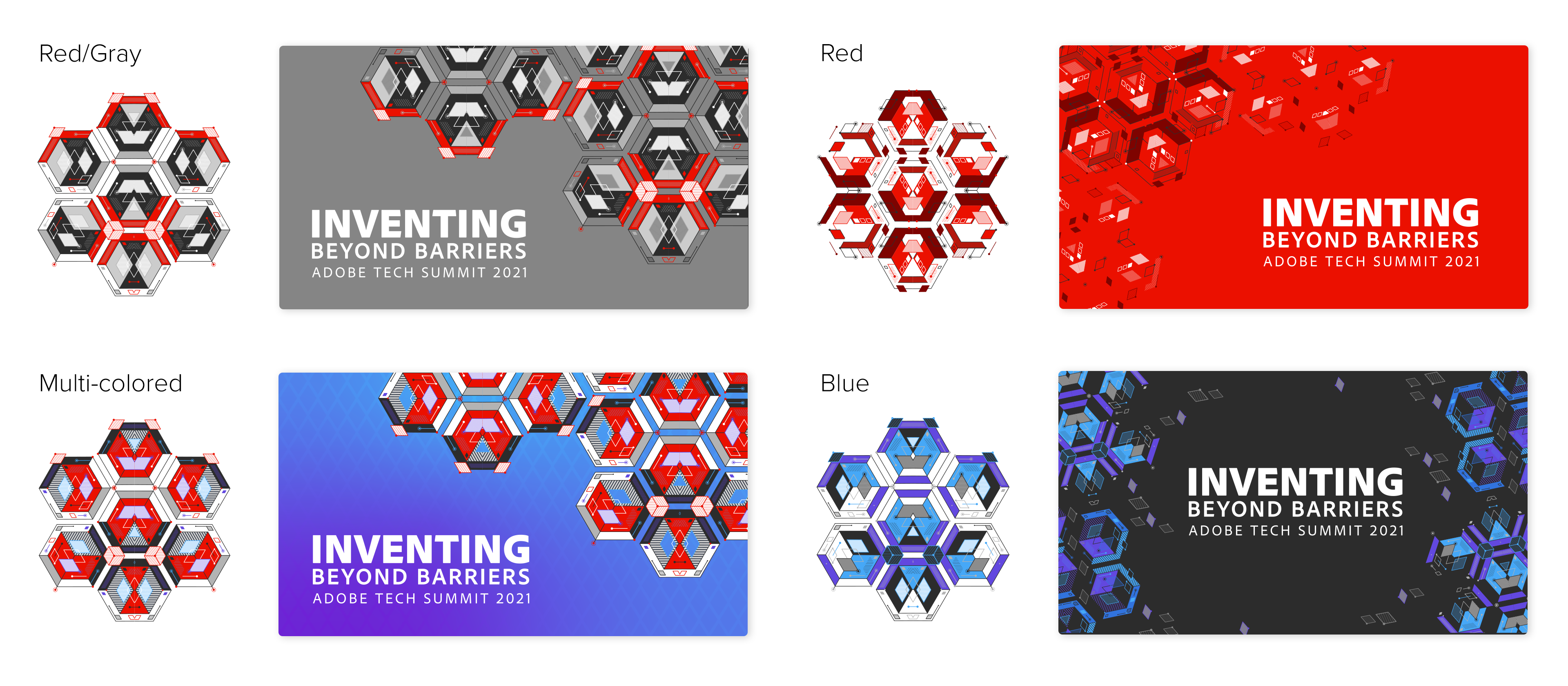
The final set of mockups I proposed and the hexes that were used in each. The bottom left/multi-colored was selected as the primary creative.
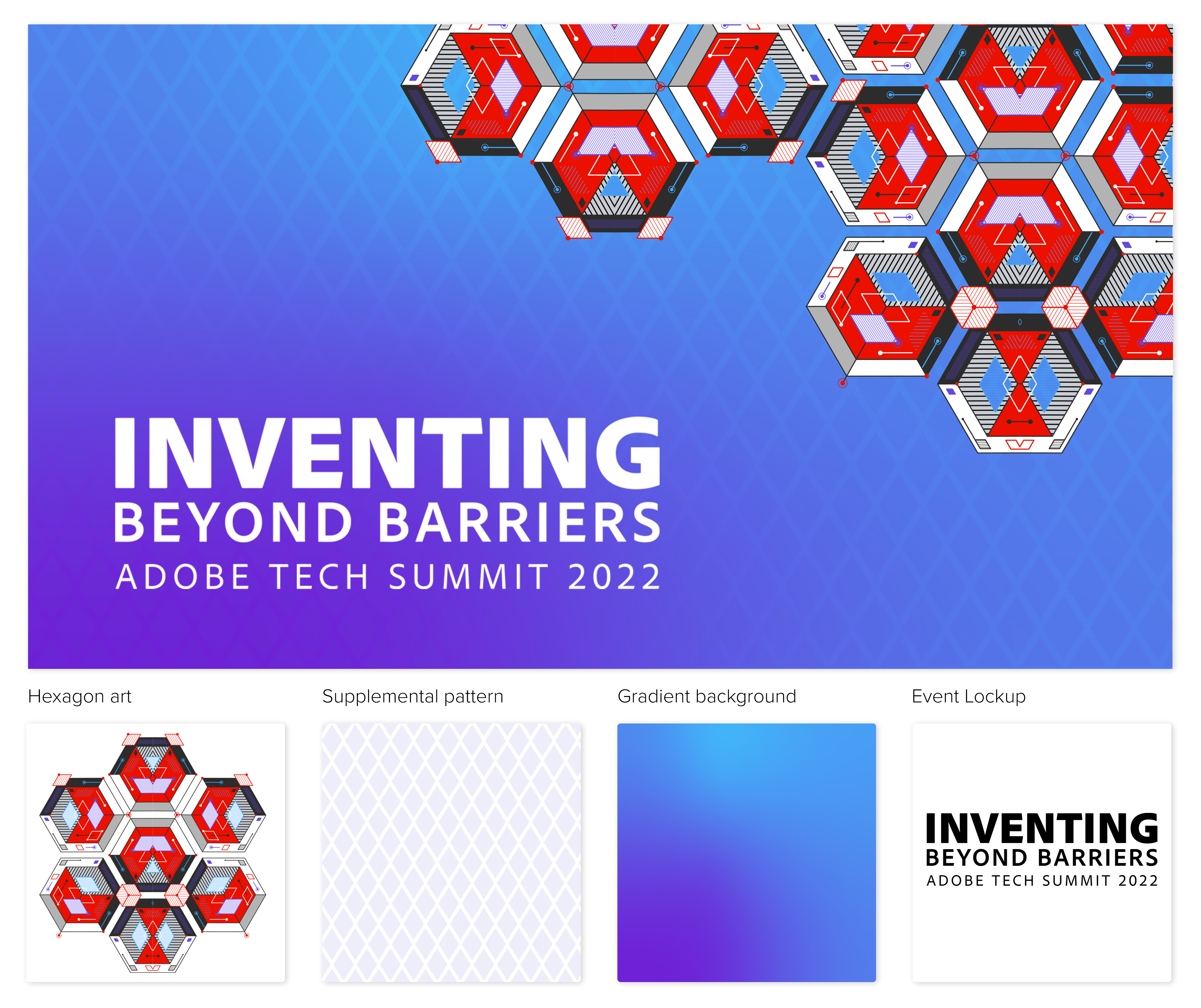
Style Guidelines
As the designer whose art was selected for Tech Summit, I prepared a set of creative guidelines to share with my team (since they were producing the media package), and communicate my vision for the art’s use. Overall, I strived to not over-explain and to keep it simple.
Requirements:
–  Event lockup
–  The hero creative
–  Color palette
–  Typography
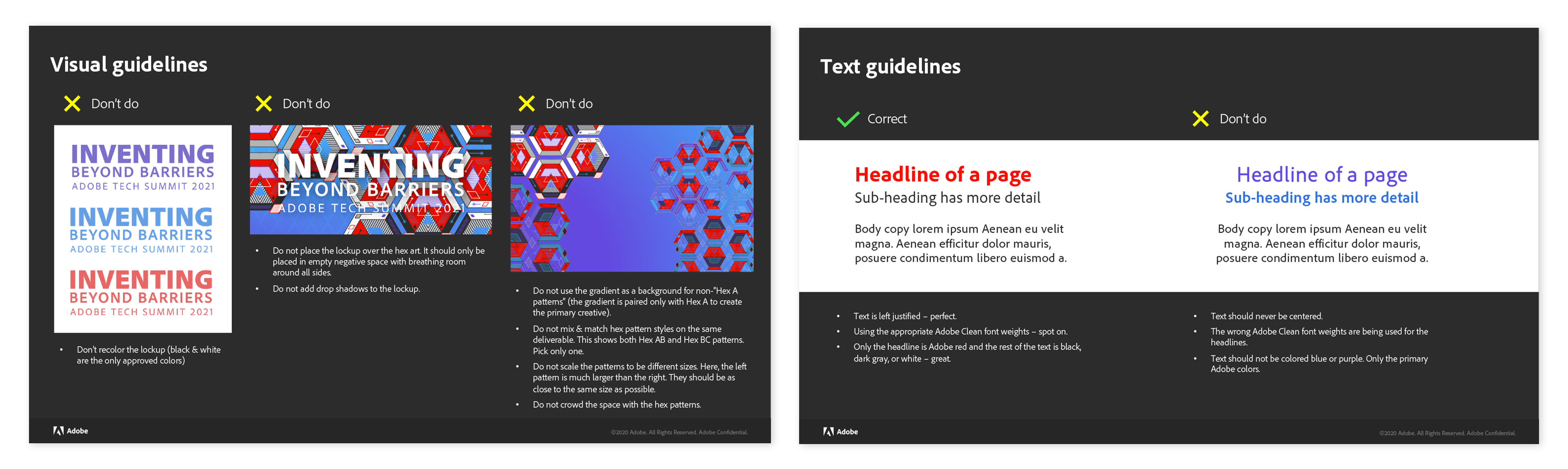
–  Do & don’t do examples
–  Different crops and examples of the art in use
Process:
–  Referenced my memory and past Adobe brand and event guidelines to note what I wanted to include in the guidelines
–  Thought through how non-designers might try to edit and use the lockup and art, which helped me prepare good examples of what not-to-do
–  Reused pages and parts from other Adobe guidelines where the same information applied to Tech Summit, like the fonts page and some of the color palette
–  Made sure to include the specific color swatches for the gradient, as that is a large focus of the art, in combination with the diamond pattern. The diamond pattern is actually the darker blue color, at a low opacity, and it blends in with the gradient beautifully, creating a natural negative space where the lockup sits.
–  Showcased a large swath of each of the 3 hex patterns and notated which color backgrounds are preferred for each (based on the colors used within their patterning)
–  Built the document in PowerPoint, exported as a PDF, posted to our file system and shared the guidelines with my team
PPT Template
Branded PPT templates are not a heavy lift, but they are something that every person touching the event uses and they need to be on brand. I originally built this template in 2021 (when the event was originally scheduled for). Coming back to it in 2022, I made small updates to the deck where I felt my original design was slightly off.
Requirements:
–  Build off of the corporate PPT structure
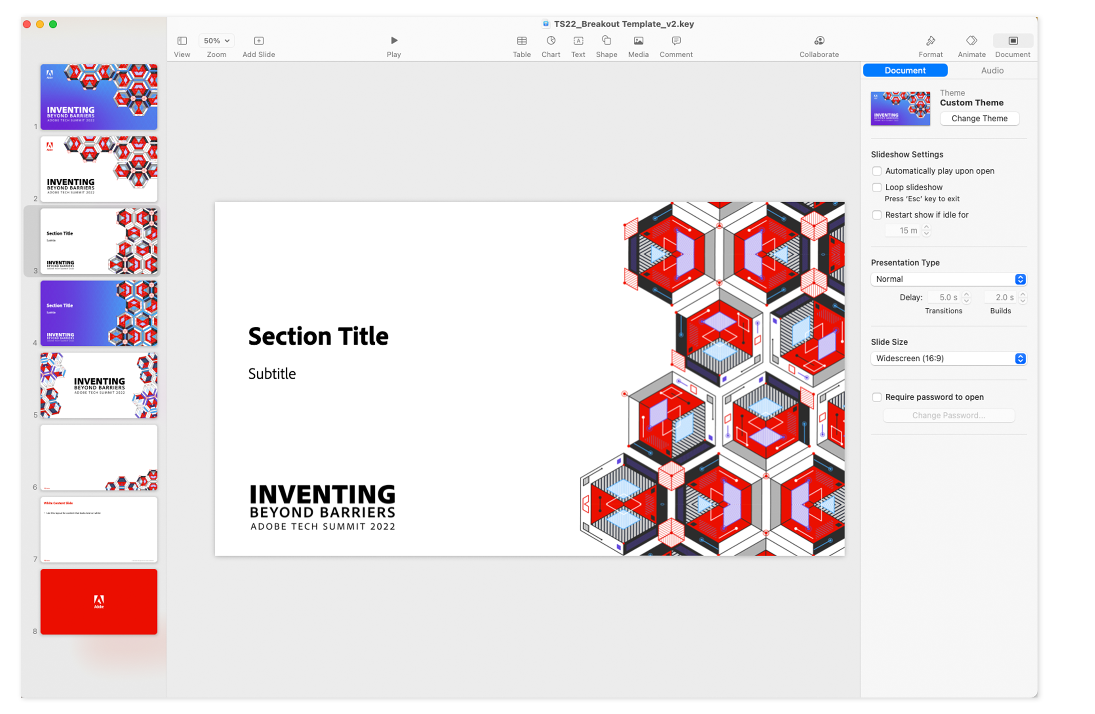
–  Basic slides with simple formatting, to keep it easy for the non-designer end user
–  Continuity of the Tech Summit branding
Process:
–  Gathered all of the individual elements that made the up tech summit visuals and pasted them each into PowerPoint, to make layouts directly in PPT (versus pasting in a composite .png)
–  Followed the stylings I had already built and explained in the style guide to create the PowerPoint template
–  Used the master slides to manage designs (and limit editability by others), which included a theme slide for both the white and blue colorways, title slide, plain and embellished content slides (to have options with best laying out copy & content)
–  Exported the PowerPoint template into Keynote, corrected text formatting, and shared it with the PPT version so our Mac users had an option, if they’d liked

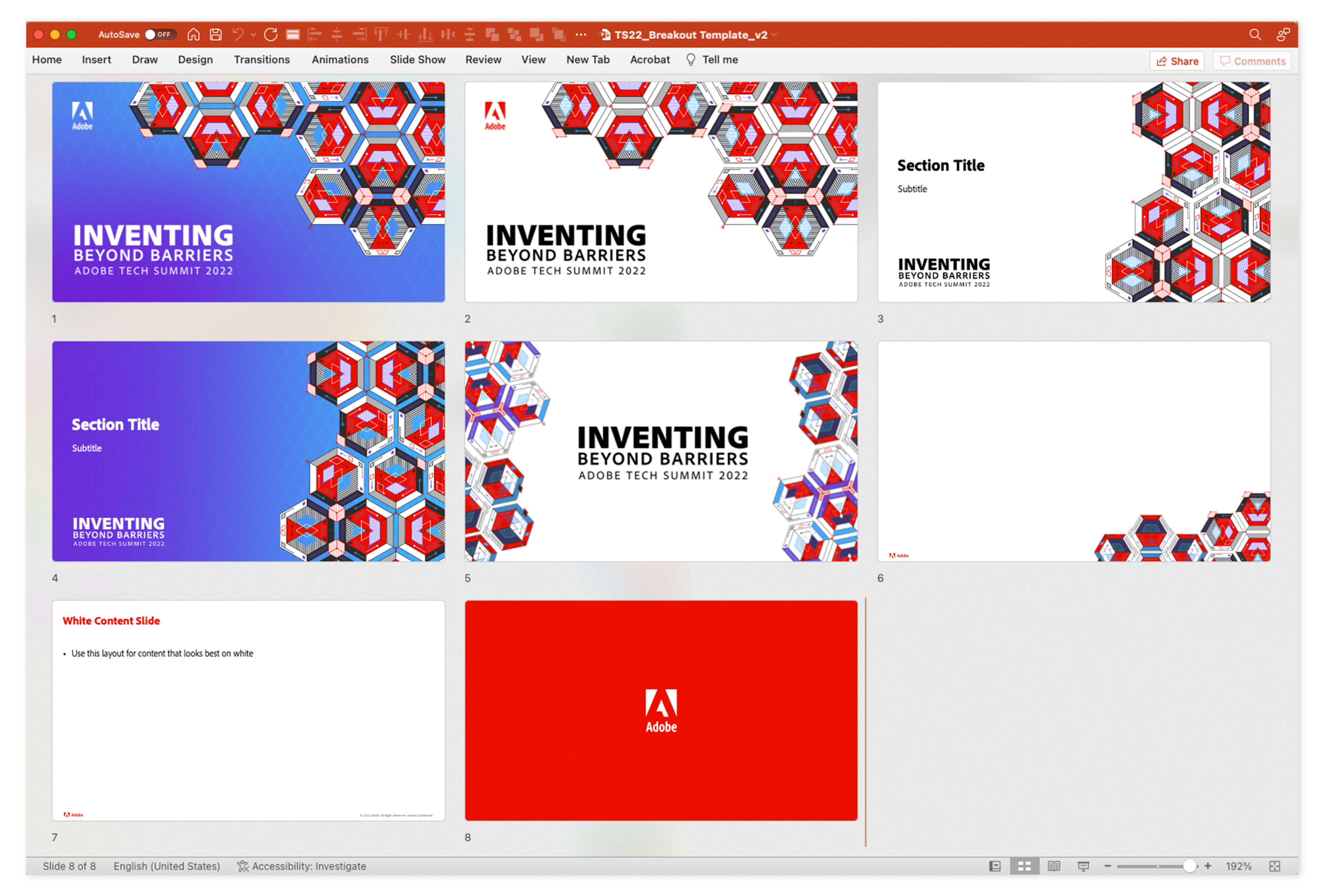
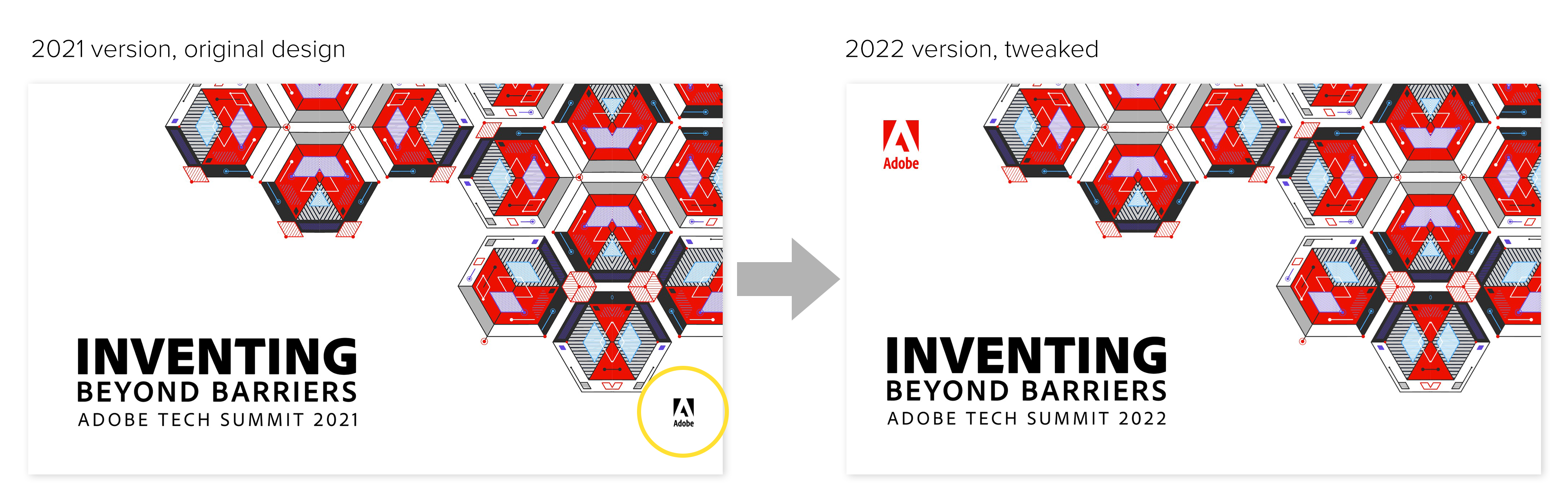
Resized, recolored, and repositioned the Adobe logo on the title slides. It looked like an afterthought in my original 2021 version.

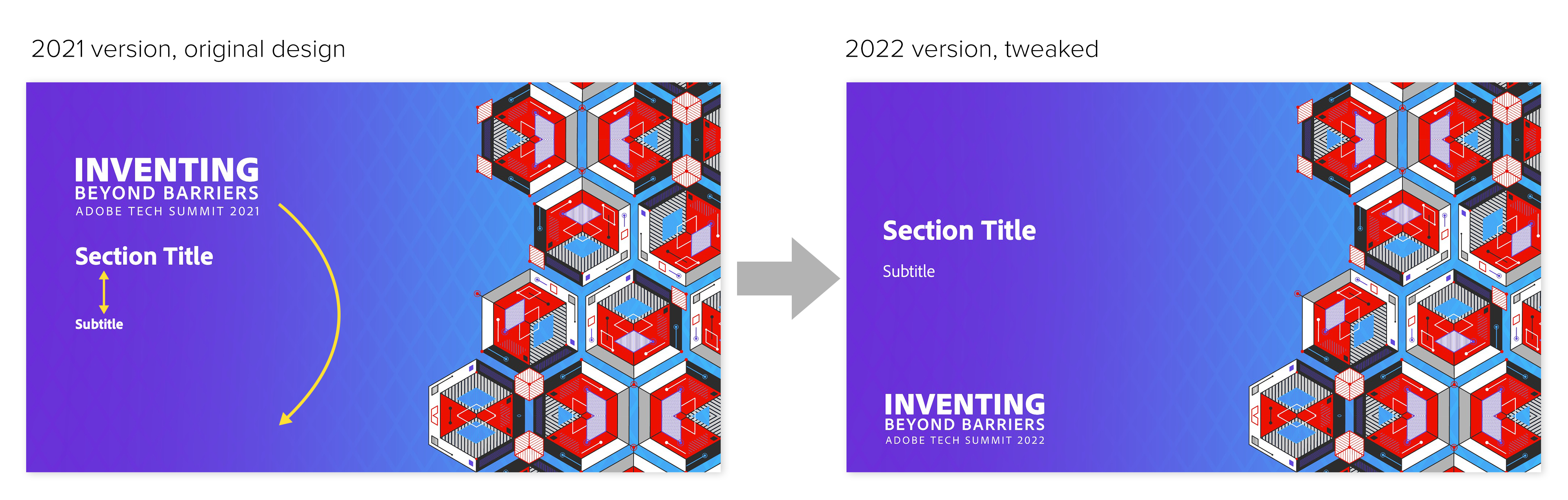
Resized and repositioned the lockup to be below the Title text. It felt heavy on top in the original, where now it grounds the text to the slide.
Repositioned and changed the font weight of the subtitle text to offer more hierarchy between the Title and Subtitle.

Daily Keynotes
Tech Summit is comprised of daily keynote sessions and breakout sessions in the afternoons. The daily keynote sessions are hosted by the Event Chairs, whose slides I designed, animated, and produced. The completed slides were inserted into a series of prerecorded videos of the speakers, to appear as if they were presenting live.
Requirements:
–  Build from the Tech Summit PPT Template
–  An agenda slide that can be updated each day with the date, schedule and speaker images
–  Send frequent reviews to the speakers and keynote producer for review
–  Transfer to Keynote and build animations
–  Track changes and own the master decks for the Event Chairs
Process:
–  Looked over the show flow from my Keynote Producer, about who’s speaking, on which day, in what order, and built a strawman PPT deck following that flow for all 5 days of the event
–  Waiting for the content, I explored with slide designs and what the potential content could look like (the PPT template only has a basic content slide and that’s not really helpful for the Keynote production).
–  Designing with a broadcast and mainstage approach, I started with the title slides for each speaker, since my keynote producer had already soured their names, job titles, and photos for me, followed by working on the agenda slides.
–  Deciding early on that all images should be contained in a hex shape, I prepared a photoshop file where I masked and exported all the headshots, and all future images too.
–  Luckily the copy in their actual slides was minimal and I was able to design with large text and graphical treatments
–  After designing the first round of slides, I sent the deck for review to the speakers and comms team to mark up.
–  I notated all show flow production items in the deck I’d send for review, so it was clear how the slides mapped to the show, where videos were, which section the slides would be used in, because they were managing lots of days of content and I wanted it to be crystal clear and leave nothing up to interpretation.
–  Once I got their edits back, I noticed the agenda slide didn’t quite fit in with the tech summit style. I had pulled this layout from a past event and the chairs liked it, but I scrapped it and put together a new layout that incorporated hexes and more negative space.
–  We went through several rounds of edits, where the stakeholders had several edits for net new slides, many text changes, and new layouts were required. I turned around the changes within the day, or even a hour or two.  
–  I split our main deck into per-day decks (Monday, Tuesday, etc), to better manage and track changes.
–  Transferred the per-day decks into Keynote (from PowerPoint) when the content was feeling final (nothing is ever FINAL in events & keynotes until the curtains ‘open’), to start animations.
–  Using Keynote was a team decision. We wanted to maintain editability and ease of use, while still having quality animations and high-res exports (for use in the video feed). Keynote was the best option, all things considered, between Powerpoint and After Effects.
–  Now starts the animation process. My manager took a few slides and animated them to set the preferred stylings, and I followed his lead applying a combination of Scale, Keyboard, Twirl, and Dissolve effects to the days’ slides.
–  I exported each slide in Keynote to a movie file that auto played the animations, and posted them to our team dropbox (where all of the PPT and Keynote files also lived).
–  At this point, the video recording of the speakers was filmed and a first cut was made. Our vendor and video editors had access to the slide exports I made and included them (as best they could) in the edit, and posted the video for review on Frame.io.
–  I reviewed all 5 days of video recordings, confirming names and graphic/slide placement was correct, notating via comments where changes needed to be made, and linking to updated video exports for them to swap in or add.
–  Videos are approved with graphics and in the hands of the production team for the show.

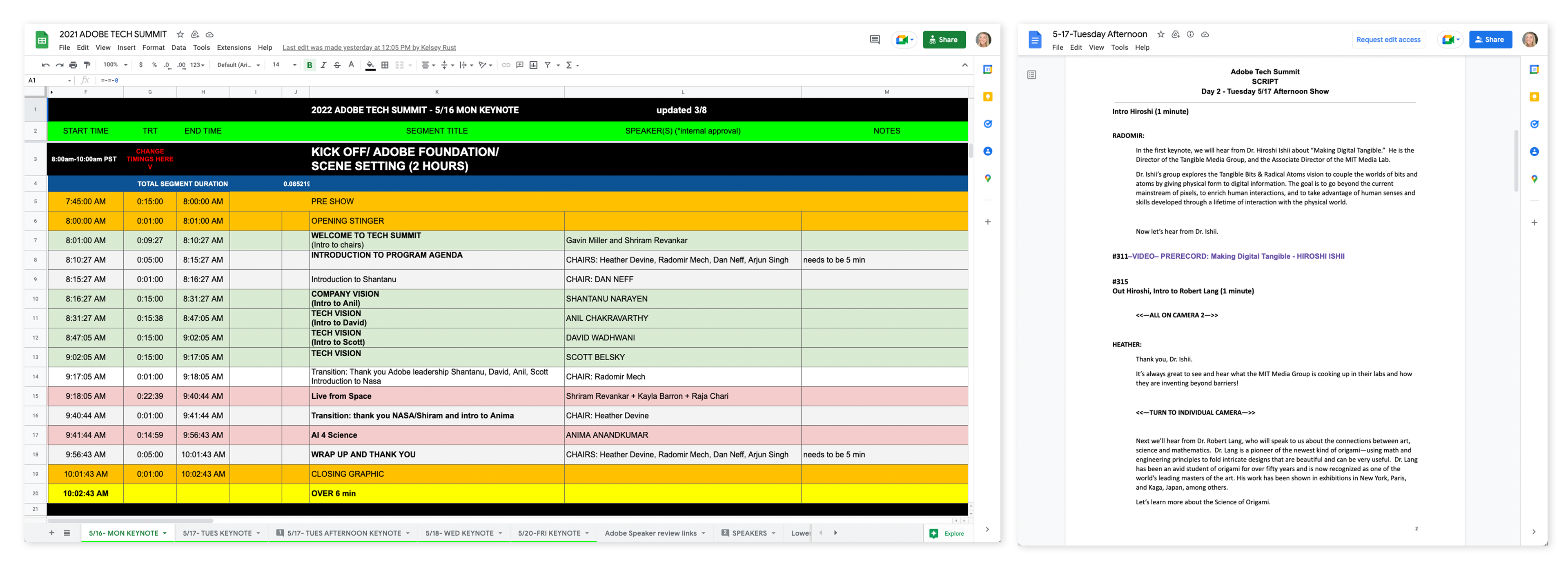
Show flow and speaker scripts provided by the Keynote Producer. I reviewed these to understand the event and how best to design for their talk track and how certain graphics could fit in the flow.

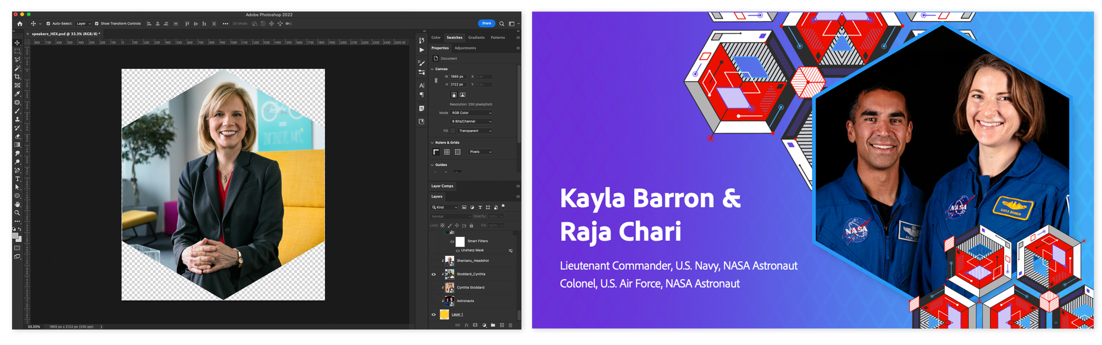
Photoshop document (left) that I used to mask all speaker images before they could be inserted into the title slide layouts (right).

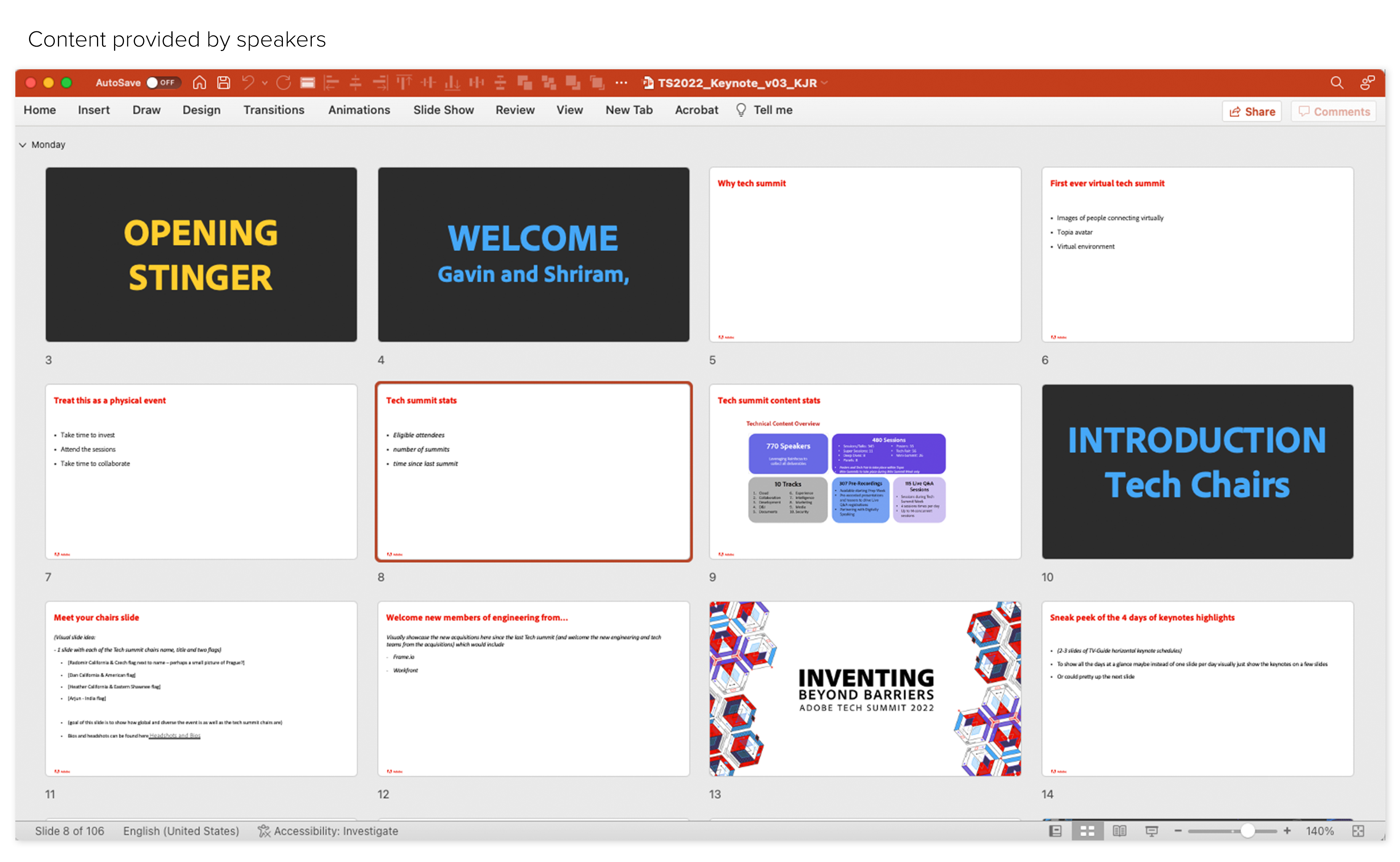
PPT 'strawman' of the speakers' content, all in text format, for me to decipher and plan visuals around.

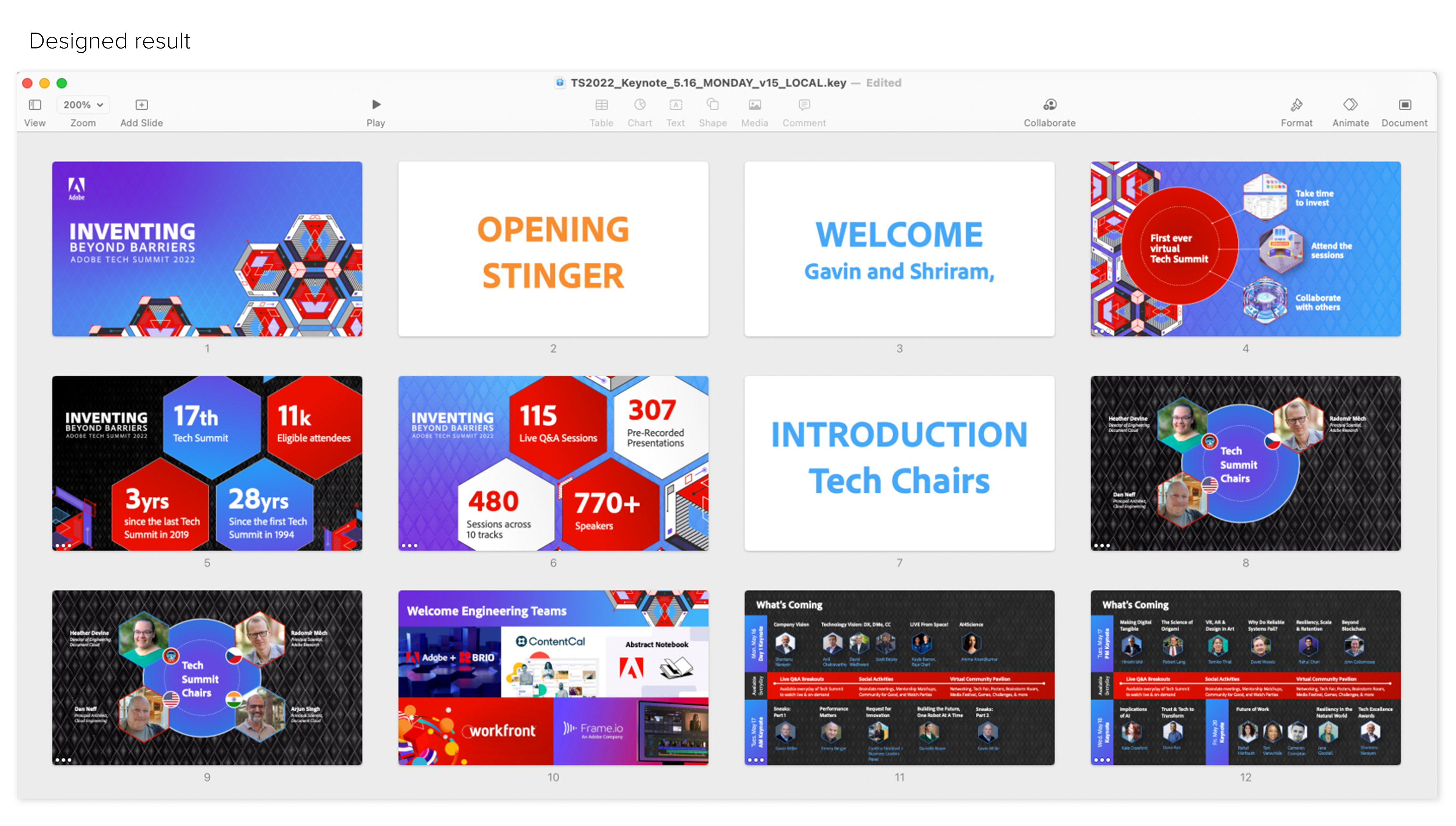
The same set of slides as the 'strawman' above, designed with the Tech Summit brand and broadcasting style in mind.

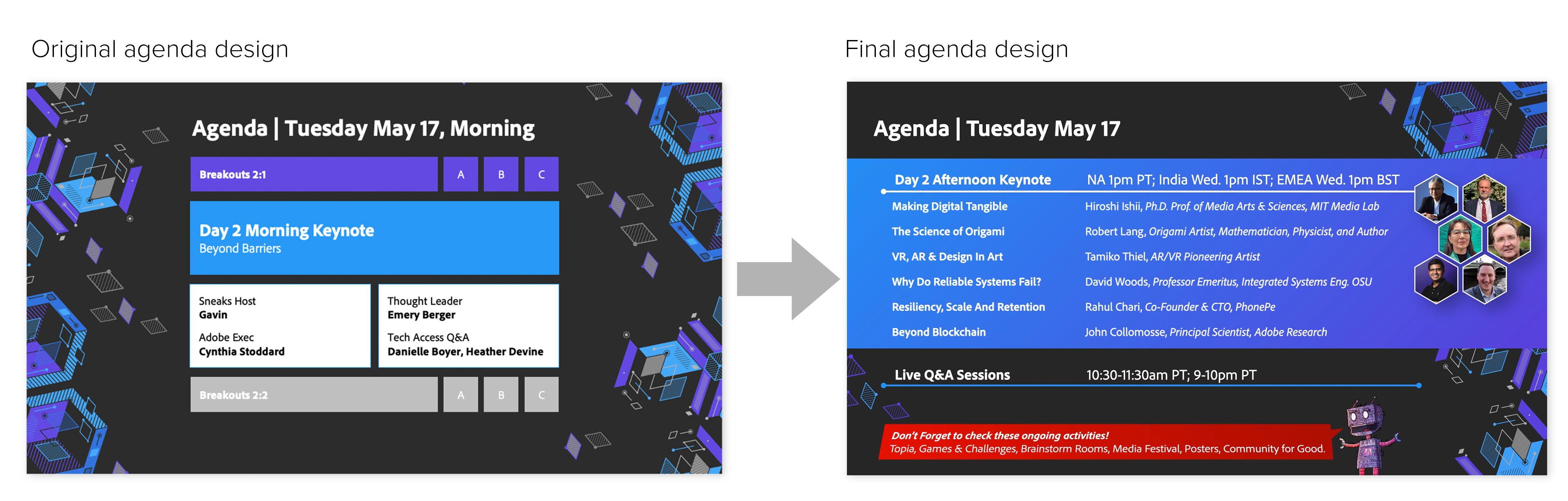
The original design wasted a lot of space and the boxes were quite rigid for the stylings of Tech Summit. The final design allowed for more copy in a easy to follow list format, as well as having room to include the speaker images.

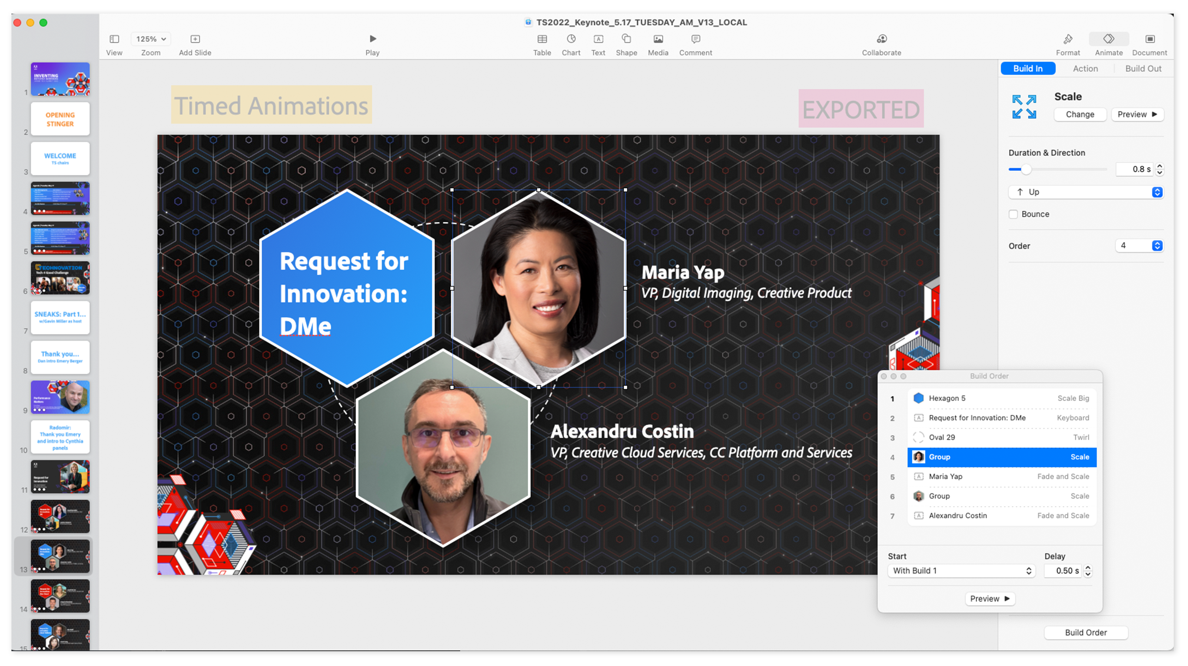
Setting up the animation and timing preferences in Keynote. Which was exported as a video file.

Sample of one of the video exports from Keynote. This is what I provided to the editor, along with timing notations of where to place it in the speakers' recorded video.

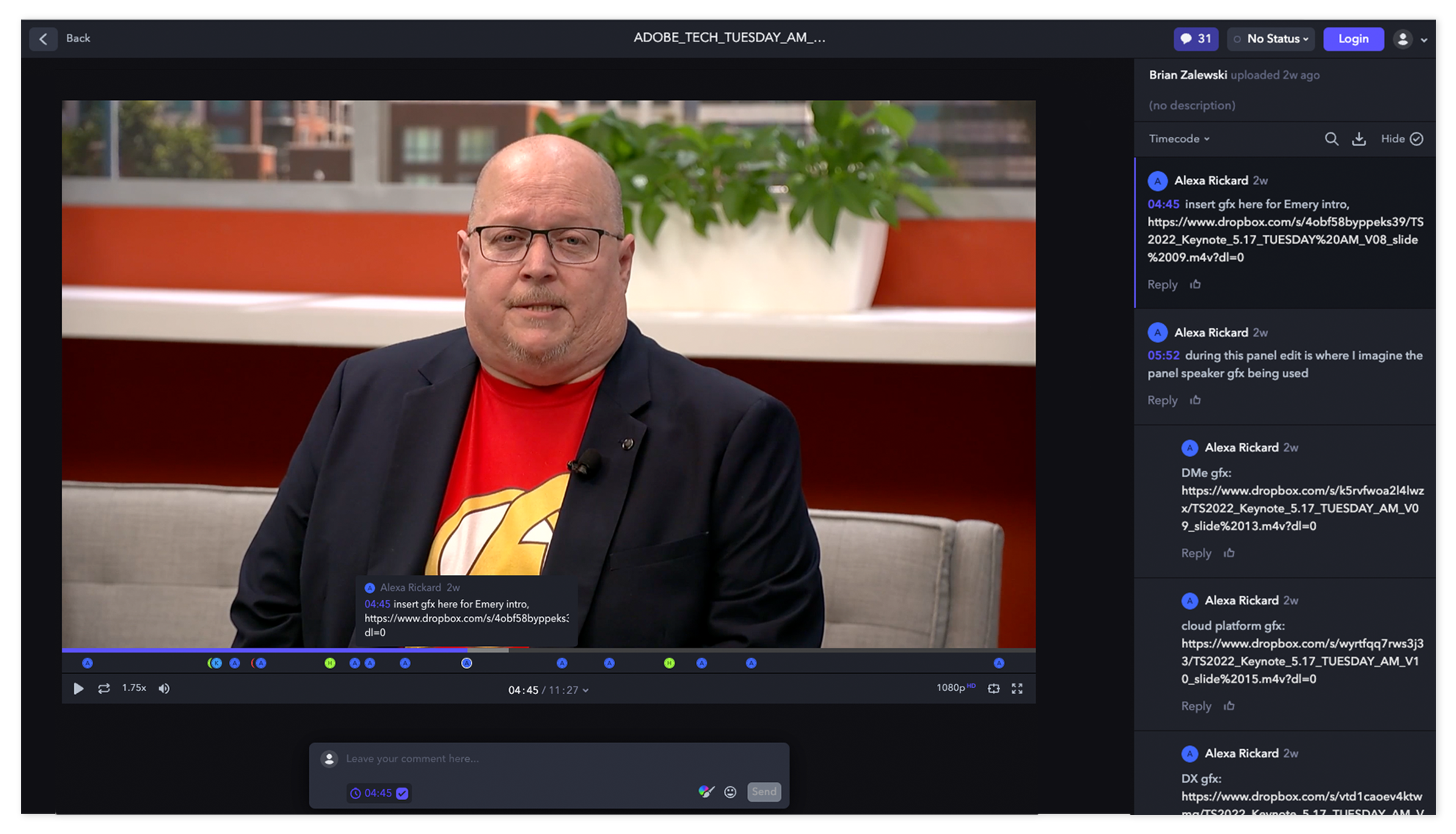
Video review tool, Frame.io, where I reviewed all speaker videos and made comments to the editor for gfx and changes needed.

Back to Top